Project Title: Warm vs. Cool Colors
Description: Students learn the difference between warm and cool colors (next step after learning the color wheel)
Author: Ginny Froonjian
Grade level or Target Age Range: Middle School
Historical Art Examples or References: Color theory; use Keith Haring’s art to ID warm & cool and discuss what juxtaposing them does.
Vocabulary: Warm, cool, pop art, mural, juxtapose
Materials: Color wheel worksheet, Keith Haring examples, paint sticks or markers, blank paper. Keith Haring icon cutouts (optional). Large color wheel poster.
Anticipatory Set: Talk about why colors are warm or cool. It’s a way to classify colors, to divide the color wheel, to plan ahead when choosing the feeling we want to convey with the colors in a piece.
Demo/Directions: (Roughly plan amount of time it takes to do each procedure)
1. Pass out color wheel worksheet; ask them to fill both sides with the correct color (3 minutes)
2. Start with side 1. Ask them to ID what they think is warm and cool with a “W” or a “C” in the margins. (1 minute)
3. Talk about what’s warm and cool. Use analogies to help them understand: Warm=hot like fire, red yellow & orange are firey colors. Cool=Cold like icy water, blue green and purple and like a cold stream or dew on grass. (5 minutes)
4. Ask them to now ID the correct warm or cool colors on the right side (second color wheel). (1 minute).
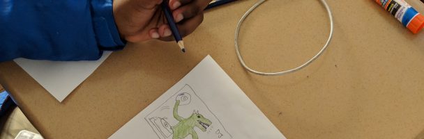
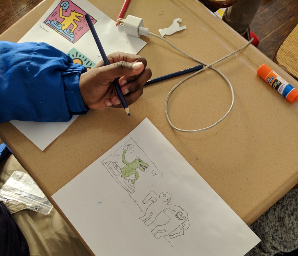
5. Pass out Keith Haring printouts. As a class, ID areas of cool and warm colors. Talk about what using a variety does with the piece: “This is a bright red figure on a blue background….how would this feel different if it was red on orange?” (5 minutes)
6. Pass out blank paper and paint sticks or markers. If you chose to use cutouts, pass out a few to each kid as well. Encourage them to play with juxtaposing warm & cool in the composition of their piece. (until end of class).
Discussion: How do warm colors tend to make you feel? How do cool colors make you feel? Do you see how an artist could use these to set the tone for their piece?
Instructional Reflection: Which instructional tools or strategies interested or helped these students learn? What additional techniques, tools or materials could be used to better support student learning? What adaptations could be made to this lesson for students with different needs levels or skill sets?
I chose to use Keith Haring as an example and inspiration for this lesson for a few reasons:
- His work is modern, urban, and will most likely be recognized by the students.
- His work is accessible to non-artists. His use of simple shapes and the lack of depth makes it easy to duplicate.