Color Wheel and Color Theory Handout

Color awareness is an important part of everyone’s life! When you choose something to wear, decorate a room or pick crayons to color and handout, you are instinctively working with a color scheme. 

Did you know there is a theory of choosing colors that complement each other? It is called the color wheel.

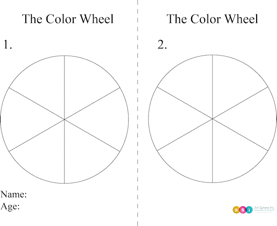
This pre and post test color wheel can be downloaded by clicking the PDF button bleow to help you learn what you already know and also help assess what you learn from today’s lesson.

Directions:

Step 1- Fold in half and start with the left side.

Step 2- Using a crayon, color and label the primary colors with a “1” and then color and label the secondary colors with a “2”.

Step 3- Label warm colors with a “W” and cool colors with a “C”.

Step 4- On the lines add the tertiary color names and  label with a “3”.

Hint: There are 3 primary colors, 3 secondary colors, 6 tertiary colors. 

Step 5- Read more below and correct you answers.

Step 6- With paper folded so you cant see the left side retake test.

The color wheel is a means of organizing the colors in the spectrum. The only colors that are not on it are black. white, and gray.

Colors are divided into groups. They are:

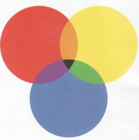
PRIMARY COLORS: cannot be produced by mixing other colors together: red, yellow, blue

SECONDARY COLORS: produced by mixing primary colors: violet, orange, green

TERTIARY COLORS: produced by mixing a secondary color with a primary color: red-orange and red-violet, yellow-green and yellow-orange, blue-green and blue-violet.

INTERMEDIATE COLORS: produced by mixing a primary and a secondary color: ex.: blue green, red violet

NEUTRALS: white, black, gray, and brown

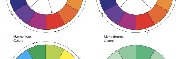
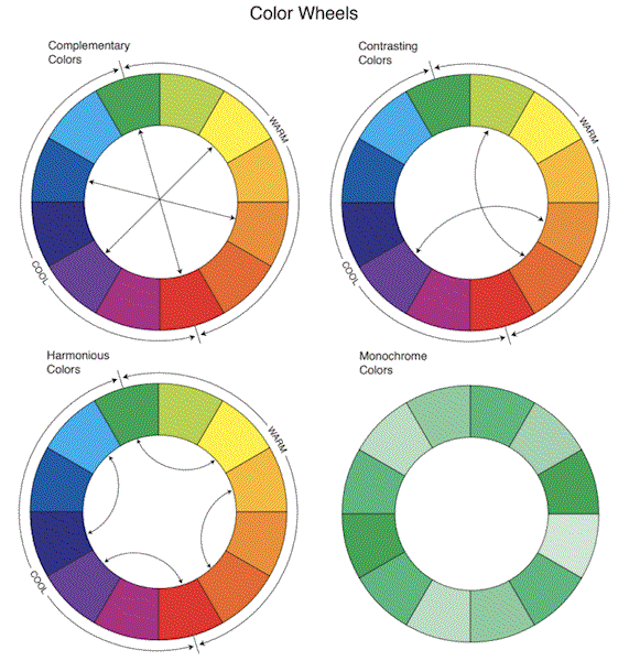
Artists, interior decorators and designers often choose a color scheme by using the color wheel.

Color schemes may be selected by choosing colors from the wheel that will complement each other.

These are:

MONOCHROMATIC: several values of one color. ex.: light blue, medium blue, dark blue

ANALOGOUS: colors that are next to each other on the color wheel. ex.:yellow, yellow-orange, orange, and red-orange

COMPLEMENTARY: colors that are opposite each other on the color wheel. ex.: red and green, violet and yellow

SPLIT COMPLEMENT: three colors that are opposite each other on the wheel, but to either side of the exact opposite, ex,: red, blue-green, and yellow-green

DOUBLE SPLIT COMPLEMENT: four colors, two on either side of two complements, but not the complementary colors. ex.: red orange and red violet, yellow green and blue green 

TRIADIC: colors that are at equally spaced intervals on the wheel, ex: red, yellow, blue and orange, green and violet
 
ACCENTED NEUTRAL SCHEME: not
based on the color wheel: uses neutral colors with one color as accent.
ex.: black, white and red
 
Properties of color
HUE: the actual color, such as red
 
INTENSITY: the brightness or dullness (grayness) of a color
 
VALUE: different intensities of a color ranging from very light to very dark
(tints and shades)
 
SHADE: change made in a hue by
adding black
 
TINT: change made in a hue by adding white
Colors as we all know are often associated with emotions.  We may describe a sad song as singing the blues or an angry person as yelling red with rage. 
 
Most people also have a favorite color. What is your favorite color? What does it mean to you?
 
The emotional properties of color are complex and stem from long ethnic, cultural, spiritual and artistic traditions and impressions of color by current images we see in advertising campaigns of products and companies we like or dislike.
 
The feelings one has about certain colors may come from the association we have with warm and cool colors in nature. 
 
Here are some historically popular associations people have with colors however yours may be different based on your experiences and can change over time. Childhood memories may play an important role in what colors you like – your dress you wore for a birthday party, a favorite Spiderman toy, 
 
RED: often associated with evil but also represents love for Valentine’s day. It can be used to represent danger and commonly seen on stop signs and warning signs. Where else do you see red? How does red make you feel? 
 
ORANGE: associated with the smell and color of its fruit namesake, pumpkins and Halloween. Where else do you see orange? How does orange make you feel? 
 
YELLOW: a cheery color that embodies warmth and light as in the sun. Where else do you see yellow? How does yellow make you feel? 
 
GREEN: signifies life or hope. Where else do you see green? How does green make you feel? 
 
BLUE: a calm, soothing, and tranquil color, sometimes associated with sadness or depression and also happy blue skies and ice cold water. Where else do you see blue? How does blue make you feel? 
 
VIOLET: a symbol for royalty or wealth Where else do you see violet? How does violet make you feel? 
 
BLACK: associated with mournful, night and is used in graphic design because it is dramatic. Where else do you see black? How does black make you feel? 
 
WHITE: symbolizes purity, truth, innocence, and light Where else do you see white? How does white make you feel? 
 
Experiment today with color! Make a picture with your favorite colors and what they mean or feel to you. Then look and see from above which color theory or terms might be used to describe your work of art.